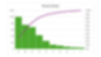
Pareto Chart
- hidet77
- Feb 5
- 4 min read
It is an essential tool that is used everywhere. But how do you use it?
1️⃣ Why do we have so many problems?
One of the first questions we should ask is why we have so many problems. I know there will be an awkward silence after this question.
One of the biggest problems with many Pareto charts is that people get used to many problems. They make one because they always do, and they talk about similar issues because they always do. They meet in front of this chart because they always do. But is this tool intended to be part of the inertia? Stop getting used to showing so many problems. Stop getting used to talking about the same thing again and again. Stop justifying the current condition.
This tool guides people to focus on significant issues that contribute to overall performance. As we work on the problems, we should see performance improvement, and the content of the Pareto chart should change. This is the tool to overcome the current condition. When managers lose this original intention, this tool dies.
2️⃣ What happened to the first problem?
Another question is, “What happened when the first problem happened?”
The biggest problem will be the high amount or frequency. Instead of jumping to the quantity, we must understand what happened when the first problem occurred.
Let’s consider machine downtime in a typical condition. A machine has a problem, and the downtime clock starts. In the next few minutes, the operator tries to troubleshoot by itself. Then, the team leader comes and tries, too. Is there a troubleshooting guide? No. They try based on their experience, sometimes making additional mistakes. Then, the maintenance is called, taking a long time to come. When the maintenance came to the machine, the production crew was gone. (They thought it was free time.) So, the maintenance checked itself and walked away, thinking everything was good. (I couldn’t let him walk away, so I interrupted and told him the problem. Another random factor.) Once the problem was understood, the maintenance could fix it in ten minutes. But the production crew was still missing when the machine was available. The machine sat idle for another fifteen minutes until the production crew returned. All these were summarized and put in the Pareto chart as a one-hour bar that said “Machine downtime.” Yes, this is “machine downtime,” but is it entirely so?
There are two types of Pareto charts. One is made under the above conditions, where Genba is not managed correctly. Under such conditions, Pareto charts represent the number of problems, or time management ignores a problem. They don’t represent the frequency or significance of a problem. They mean random management involvement, which happens in many places. Sometimes, I observe differences in approach to a problem by different shifts. A particular shift might have better management capability and resolve issues quickly. In such cases, the data shows how close a problem happened to a good shift, not the size of the problem. Therefore, even with the same problem, the impact is different. Management itself is a huge variable.
Under the Toyota production system environment, Andon is immediately pulled on the first problem when it occurs. The team leader immediately responds. Therefore, the frequency of Andon pulls represents the frequency of a problem. The team leader is trained on many topics and problem-solving. Escalating the problem from the team leader to higher management is fast. The data will highlight what happens frequently and lead the organization toward significant issues. Data accuracy or fact control belongs to management.
Again, please ask what happened when the first problem occurred. In many cases, management reaction is the hidden most significant variable.
3️⃣ Why top XX issues?
With a Pareto chart, typically, an organization chooses the top XX issues to focus on. But how did they decide those top XX issues?
One of my coach's standard questions in front of the Pareto chart was this. The answer is that we don’t have enough resources to work on all issues. Then, my coach starts counting how many people are in front of that Pareto chart. Typically, we have more people than the number XX issues. In many cases, managers try to exempt themselves from the count. But my coach would laugh and say, “The manager should take the most complex problems.”
Is there any logic in this “top XX problems”? I guess this comes from misunderstanding the Pareto principle or the 80/20 rule. 80% of the consequences come from 20% of the causes. But then, shouldn’t we ensure that the “top XX problems” accumulate to 80% of the result? Isn’t there a need to ensure the minor problems don’t grow into significant issues by the following review? It looks like these “top XX issues” were determined without any logical explanation other than that’s how we have been doing. It is an excuse to exclude someone from problem-solving.
Pareto chart. It is a powerful tool if we use it in a good way.